
I am writing a young adult mystery novel about a 15-year-old girl living in rural Pennsylvania who discovers her guardian is a vampire while investigating the death of her father.
It’s not a traditional “vampire” story. It’s more of a squishy/full of feels/coming of age story with “vampire” being a metaphor (of sorts) for any group that gets marginalized/victimized. In other words, instead of picking a “real” minority or a choosing a specific illness with perceived limitations, I chose vampirism.
I HATE the labels society puts on us. Even worse, I HATE the labels I’ve put on myself over the years (lazy, stupid, not good enough, etc.) and this is the book I’ve played with, on and off, in my delusional attempt to address these BIG issues (and more) in a “safe,” young-adult-friendly way.
Writing a novel is hard work! I feel like Captain Ahab and this book has been my whale. But facing my fears has been MUCH harder than the actual writing.
So…not only am I writing once more, I’m playing at making book covers. I made MANY practice covers for imaginary books first, then I made covers for my old Wattpad stories, and then…I made a dozen covers for the book I’d like to FINALLY publish. These are two favorites of that bunch:
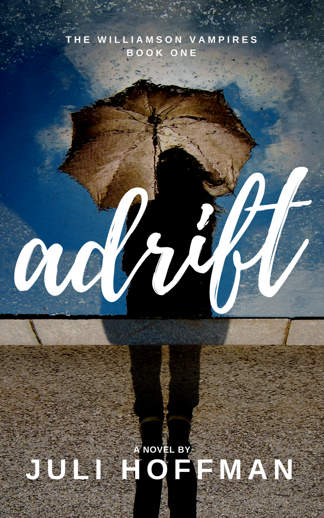
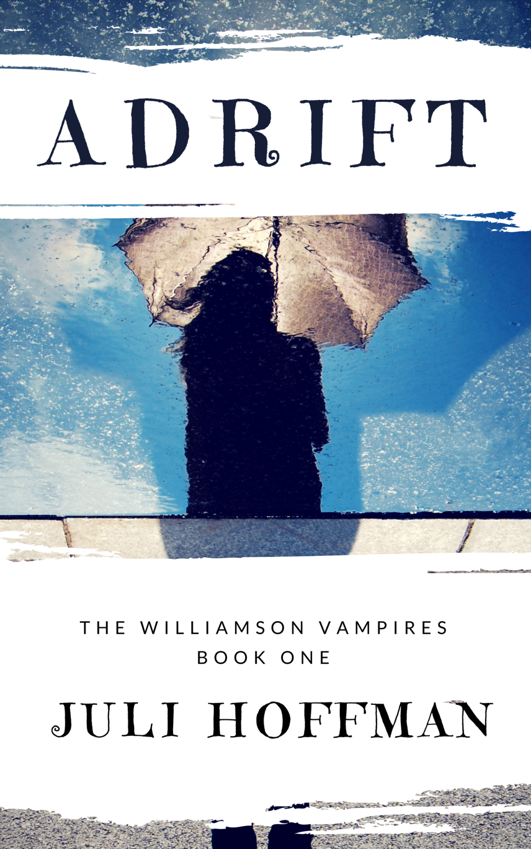
Let me know what you think. Any advice will be appreciated. I am a TOTAL newbie at this cover making stuff. My computer skills are not that great. I am REALLY stubborn so that seems to have helped…but experience is BETTER!!! LOL
xo Juli


I’d never even thought of designing your own book cover (traditional publishers have final say about that) — but it seems like a great way to clarify your thoughts about the tone, intended readership, etc. My husband has had several non-fiction books published, so I’ll pass on one of the things he learned: Don’t neglect the spine! Once a book is on the shelves, that’s what potential readers will see — the title and your name. Once, when he got his package of the finished books, he realized that the publisher had left his name off the spine! (He said, “This was the book that was going to make my reputation — and my name isn’t on it!”) A distinctive but highly legible font is also important for a series because it will help the people who liked one of your books to spot the rest when they’re on a shelf — so, when planning a series, consider future titles, too. Best of luck!
LikeLiked by 1 person
That’s EXCELLENT advice! If I was your husband, I would be mortified to have my name missing off the spine of the book. Did the publisher correct it?
LikeLike
I’m the librarian for my church and I agree with Witness2Fashion that there must be a well-designed spine. It should have the title of the book and the author, and it should look professional, not just black ink on a white spine. Good luck! I voted for Cover A.
LikeLike
Thank you!!! It’s such a forgotten area, yet you’re both right!!! The spine is the FIRST thing you notice when the book is shelved.
LikeLike
I voted for Cover A. It looks more professional, plus I’m not a fan of “boxes”, which I see in the second one. I like a cover that pulls everything together in one picture. I think you do a great job with that in the first cover.
LikeLike
Thank you! I think it looks similar to the style of covers I’ve seen in YA, but not exactly like everyone else. 🙂
LikeLike
Welcome to that little voice and thank you for following my blog.
LikeLiked by 1 person
And thank you for following mine!!! 🙂
LikeLike
I had to be different and vote for B. 🙂 I like how the series and author names are placed on the front. I think that will give you a “focus” and a way to coordinate the series. 🙂 Just my $.02!
LikeLiked by 1 person
I like your 2 cents!!! I made more than a dozen covers before I began to narrow them down. SO much fun!!! I like the second one, too. (I like them both) 🙂
LikeLiked by 1 person
Julia, I LOVE cover A. This is exciting. Like you, I hate labels. I think your idea here of using the vampire to talk about these issues is terrific.Congrats on the new book.
LikeLiked by 1 person
Thank you so much!!! 🙂
LikeLike